[QUOTE=RileyFiery;65815]I’ll mess with it later Mirage if you don’t care.[/QUOTE]
Please do. Right now it looks like Ironmans shit in my opinion.
[QUOTE=RileyFiery;65815]I’ll mess with it later Mirage if you don’t care.[/QUOTE]
Please do. Right now it looks like Ironmans shit in my opinion.
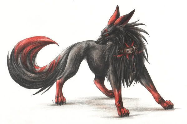
Im making a wolf baddy, it looks good right now.
Trying to get something like this:

Some bombs.
[ATTACH]1716[/ATTACH]
looks very plain
[QUOTE=benjiro;68518]looks very plain[/QUOTE]
I think what Benjiro means to say is: Learn some shading, we can see through your diagonal gradient ![]()
Bleh.
[ATTACH]1953[/ATTACH]
I need to add a keyhole. Don’t really like my gold colors that much either. Need to make it bigger also.
Any of these look good? Also, I can’t seem to get the keyhole right. Any advice? Also, the numbers under the chest are the color I want the keyhole.
[ATTACH]1954[/ATTACH]
Riley, I tried following your advice in your PM, hows this?
[ATTACH]1955[/ATTACH]
[ATTACH]1956[/ATTACH]?
Nipples
It looks good.
But what the fuck is it for? It isn’t remotely like LTTP chests, it totally would be out of place.
Also seems out of Graal perspective. x_x
[QUOTE=Kondie;74598]Also seems out of Graal perspective. x_x[/QUOTE]
…
[QUOTE=Yenairo;74600]…[/QUOTE]
It was just to try to get back in the swing of things, I haven’t made a graphic in awhile, so I had to practice. I’m not going to use it for anything.
Also Riley, moved it down.
[ATTACH]1957[/ATTACH]
I tried to fix it. :3
Nice job Mirage…
If my opinion matters at all, which is probably doesn’t, I like Kondies edited version more right now…but Riley thinks otherwise so…I’m probably wrong :0
Riley was paying attention to the details. I think if I fixed up what he didn’t like a bit more, he just might think it fits. Was just trying to help Mirage get a better vision. Thank you, Alex.
Got bored so I shaded the nyan cat.

yep.
That thing will always look like shit. o_O (Waits for Riley or Shiny to prove me wrong)
Fag. Too many colors now.