I attempted fire and wind element icons but I suck. Not even worth posting.
[ATTACH]1932[/ATTACH]
I might try making a spell graphics later, but I dunno, I’m kind of in a slump.
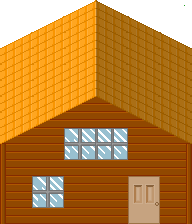
Ok ive been trying to further better my graphics and I think I have an ok style starting to go on. This is a house I made with a few of my new tiles.

Some constructive criticism would be nice 
Looks nice, but it looks flat. Try darker roof tiles near the bottom, and same for the bricks. Also, I think what you did with the side brick tiles should be done for the bottom of the house. Overall, looks nice. Good job.
Have you been using RileyFiery as an example? They look tailored towards his style.

Um, these graphics look nothing like Riley’s. o_o I love the house tricxta, it’s done pretty well. Great job.
im kinda just examining everyones work I like, mainly shinies and rilies so im kinda doing it in a similar way to theres in terms of applying lighter colours to edges and such. So yer I can understand why you would say such a thing…

This would be the closest to rilies work in my tiles in terms of colour use… mind you the walls on the house arent that great so i might just space them out to create a more planky feel.
:o thanks riley, im gunna try fix some of that now
_> I wish I had some examples to give to you.
I’ve never really taken a stab at making a tileset. I mean, there was the castle-y part of TF, but that was it.
Well i tried to add some depth to the roof and I did mirages idea but added a ledge as well :o

For better or worse? Also I deleted those tiles in the previous post since I felt as though I could do much better with some thinking.
->
That would help next time you make a change. X_x
It was hard to find the difference, until I compared them like this.
edit: the door looks weird, make the glass be 3 pixels in from the top left, and put it 3 pixels from the right side if you know what I mean. If that doesn’t look right, play with it.
edit2: I’m not even sure that’s the problem. I just can’t put my finger on it.
I think those houses generally suck. 
The roof looks like something you would see in a quiet area of town, and the brick doesn’t go too well with the roof. And then you have like red beams on the side. It’s kinda weird, they also distort the building a bit.
I do like the roof shingles.
Eh, I tried to edit it a little. I tried to fix up the bottom ledge thing, and the roof (It’s uneven though and didn’t want to re-proportion the bricks). Anyway, I just made a reference picture for some ideas.
[ATTACH]2199[/ATTACH]
The roof didn’t need improvements at all.
The door and the wall did though.
@riley
sure edit it please, I love to see what I can do better
@spooon
lol, 
Ok so I worked a bit more on my tiles.

This is suppose to be more a sub-urban house rather then right in the city.

I was going for a dark evil corporate look here lol.

And this would more of an apartment kind of building.
Criticism and notes on how I could make it better please?
Dude. That dark ass building is scary. It’s awesome.
God damnit I can’t take it anymore.
THE ELEMENTS OF CRAB CLAWS, EMO TEAR, POTATO AND PUBIC HAIR.
[QUOTE=tricxta;77016]
Ok so I worked a bit more on my tiles.
This is suppose to be more a sub-urban house rather then right in the city.
[/QUOTE]
My mind keeps playing tricks on me with this one… It keeps looking like the wooden part is the floor and then like it’s a wall… Ahhh it won’t stop! I don’t know how you could fix that though. x_X