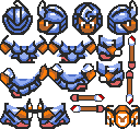
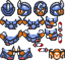
I made these two baddies, inspired by spear soldiers in LTTP in an effort to mix it up a bit,
since I use regular baddies extensively. The way I’ll use them is set them up as Gold Warriors,
for the full heart of damage, then give them one less half-heart of health. So, for example,
the blue spear baddy only takes two hits to kill, but he takes away one heart with each hit.
Personally I like how I gave the red one a halberd to go with the curvy blades theme =D
Also, I’m working on a dagger version (again inspired by dagger soldiers from LTTP) of the
blue and grey baddies, which I’ll post when I’m done.
Edit: and yes, I like photobucket, it lets non-members see the images =P
___Merged doublepost__________________
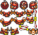
Finished: …
These two are much simpler edits, I just made the swords really small. For these I’ll make
them count as Lizardons, so they run much faster (daggers are light) at the cost of not
being able to parry attacks (daggers are short and bad for that sort of thing).
Hopefully these will help spice up combat in and out of my dungeons, since blue baddies
are still standard fare in the third dungeon.
I’ve been working a lot with backpals because I want to redo my two existing dungeons to make them look less like crap (well, the mines didn’t LOOK bad, they were just boring) and overall make them feel more like good old-fashioned Zelda dungeons. For the swamp the obvious choices were green walls, purple floors. Of course, every good zelda dungeon has, y’know, doors. The castle part of the tileset does not.
So, here’s four pictures. two of a green west puzzle door, and two of a green east locked door.
… …
Personally I’m happy with the former, since it’s pretty much based on LttP doors, with an extra “eye” in the middle to make it look either more or less threatening (after all, it could be three angry eyes). The latter, however, sucks. after a while I just decided to move on and hope it looks decent enough in game.
The second frames for each, of course, are the doors partly open, which when you flash them for .2 or .4 seconds looks pretty good. If anyone’s hurting for door sprites THAT much, you’re free to repallet and use them, but I’m willing to bet most of you can do better.
Oh, and if anyone feels like making the key door suck less, I’d appreciate. =D
[QUOTE=Eathanu;14241]
I’ve been working a lot with backpals because I want to redo my two existing dungeons to make them look less like crap (well, the mines didn’t LOOK bad, they were just boring) and overall make them feel more like good old-fashioned Zelda dungeons. For the swamp the obvious choices were green walls, purple floors. Of course, every good zelda dungeon has, y’know, doors. The castle part of the tileset does not.
So, here’s four pictures. two of a green west puzzle door, and two of a green east locked door.
…
Personally I’m happy with the former, since it’s pretty much based on LttP doors, with an extra “eye” in the middle to make it look either more or less threatening (after all, it could be three angry eyes). The latter, however, sucks. after a while I just decided to move on and hope it looks decent enough in game.
The second frames for each, of course, are the doors partly open, which when you flash them for .2 or .4 seconds looks pretty good. If anyone’s hurting for door sprites THAT much, you’re free to repallet and use them, but I’m willing to bet most of you can do better.
Oh, and if anyone feels like making the key door suck less, I’d appreciate. =D
[/QUOTE]
the shading of the dungeon (not the keyhole ones) doors middle eye is incorrect, let me assist you later
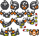
I’m actually happy with these, though I don’t know what anyone else could think of them. They’re very simple, and almost have a futuristic quality to them, but they look okay in-game. I’m using they grey stone for the forest temple, an old tower repurposed for baddy training (hey, they have to get their blind rush tactics from somewhere, eh?)
Anyway, the main point is that I really don’t want to start from scratch again, since this is attempt #3 -_-
Problem is, I think you’re having some big resolution conflict here. While the stuff you’re editing is mainly edited from old Zelda sprites, and therefor look like a lower resolution(thicker lines mainly, but still, everything looks 2x), your stuff is fine down to a high resolution of pixels, therefor it looks… well, exactly like it does in your pictures. Small pixel stuff being stuck in large pixel stuff.
You’d probably be better off just using a 2x square brush instead of a 1x. Also, Graal tends to double the pixels on its turns rather than leaving it clean:
Which helps things look a bit thicker than they really are. A combination of the above things should accomplish what you want. I mean if you want to use LttP graphics that’s fine(though you’d be skipping a crucial point of being able to adapt to styles) don’t supereagle it though.
 …
…
 …
…


 don’t supereagle it though.