iDylan
April 23, 2013, 4:59pm
21
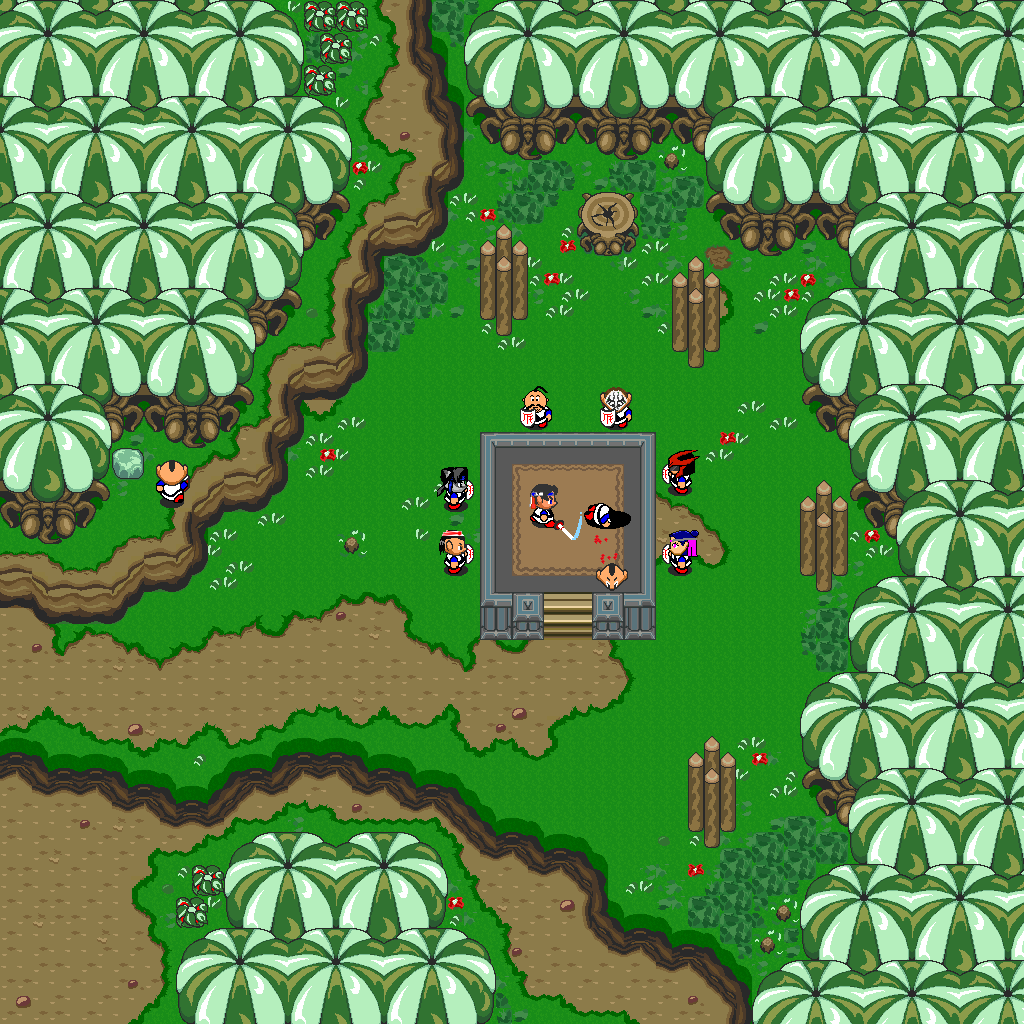
Your levels are actually pretty nice. The one consistent criticism I have with them is the spacing of all the “detail” tiles. More specifically, the flower and grass tiles in each of the screenshots are very unnatural feeling.
A similar thing happens in pixel art, which they call “the grid,” but basically the idea is applying here. You want to make “the grid” disappear, or the artificiality disappear. You want to make the tiles blend into the scenery, so much so that it feels natural. The tiling doesn’t fit in with the “world” and it makes a player aware that they are playing a game (I mean this in a figurative sense. Of course a player is “aware” they are playing a video game).
If you’ll note the grass here - this is consistent through LTTP. Patches of grass and flowers. Now, this isn’t my personal style, but it works really well, especially with the classic tileset.
I understand everyone has their own style, but “style” shouldn’t justify banality.
Thanks for replying :). I see what you mean, but when i try to put certain tiles next to each other (for example flowers and gross like in the LTTP picture) and then look at the result, i can’t help myself to spread it out or completely redo it. It’s just a style i developed.
Spooon
April 23, 2013, 10:09pm
22
Who is the asshole that ran around dropping bricks everywhere?[COLOR=“Silver”]
---------- Post added at 11:09 PM ---------- Previous post was at 11:08 PM ----------
[/COLOR]
Your levels are actually pretty nice. The one consistent criticism I have with them is the spacing of all the “detail” tiles. More specifically, the flower and grass tiles in each of the screenshots are very unnatural feeling.
A similar thing happens in pixel art, which they call “the grid,” but basically the idea is applying here. You want to make “the grid” disappear, or the artificiality disappear. You want to make the tiles blend into the scenery, so much so that it feels natural. The tiling doesn’t fit in with the “world” and it makes a player aware that they are playing a game (I mean this in a figurative sense. Of course a player is “aware” they are playing a video game).
[img]
If you’ll note the grass here - this is consistent through LTTP. Patches of grass and flowers. Now, this isn’t my personal style, but it works really well, especially with the classic tileset.
I understand everyone has their own style, but “style” shouldn’t justify banality.
Should have just shown one of my levels. ;D
One of Spooon’s levels.
BTW, there is still a “Level of the Week” challenge: http://forums.graal.in/forums/showthread.php?7081-Level-of-the-Week-Challenge-4
I’m sure people have forgotten, but we still are looking for participants. Really it only takes one submission to get the ball rolling.
hosler
April 23, 2013, 10:55pm
24
Lol! Get rid of the grid by making the level look like a butt crapping out a turd. Even after what I just said, that level is very appealing.
iDylan
April 24, 2013, 1:24am
25
Who is the asshole that ran around dropping bricks everywhere?[COLOR=“Silver”]
---------- Post added at 11:09 PM ---------- Previous post was at 11:08 PM ----------
[/COLOR]
Should have just shown one of my levels. ;D
Sorry, as i said i’m used to detailing :p. I just removed them and i think it looks better. [ATTACH=CONFIG]3430[/ATTACH]
iDylan
April 24, 2013, 1:25am
26
Damn, that looks pretty good. About the Level of the Week challenge, i’m not going to participate in this one. Honestly i hate doing inside levels.
Spooon
April 24, 2013, 1:31am
27
Looks better with the random bricks gone. Put some variety in the dirt.
Exactly, dirt variety RAWR
Raiks
May 4, 2013, 8:51am
29
Looks good.
looks like shit…